
Liam Olson
Hello! My name is Liam, and I'm a second year Graphic Design BFA major at Rochester Institute of Technology in Rochester, NY. I have a lot of passion for all kinds of art and design, ever since I was young. Since high school, I have been taking graphic design classes and gaining knowledgable experiences from different projects I'm approached with.In my future career, I hope to work on improving access for all disabilities through design.
To see my portfolio, scroll!
my work! ⬇
Projects Showcase


Book guides leaders to turn disruption into opportunity through strategic insight and smart risk-taking.

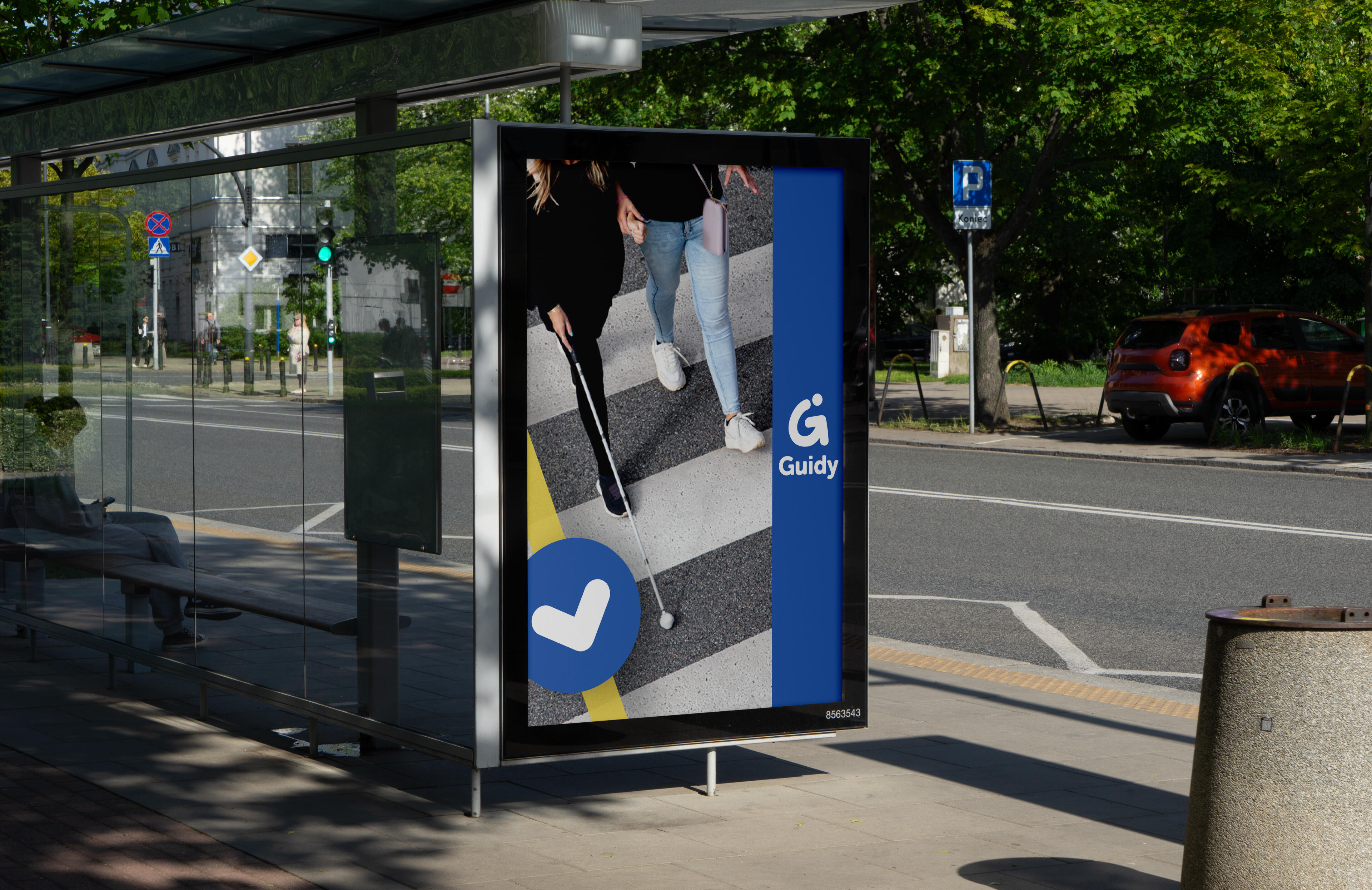
Application for your phone which helps guide people with disabilities to accessible places. (CLASS PROJECT)

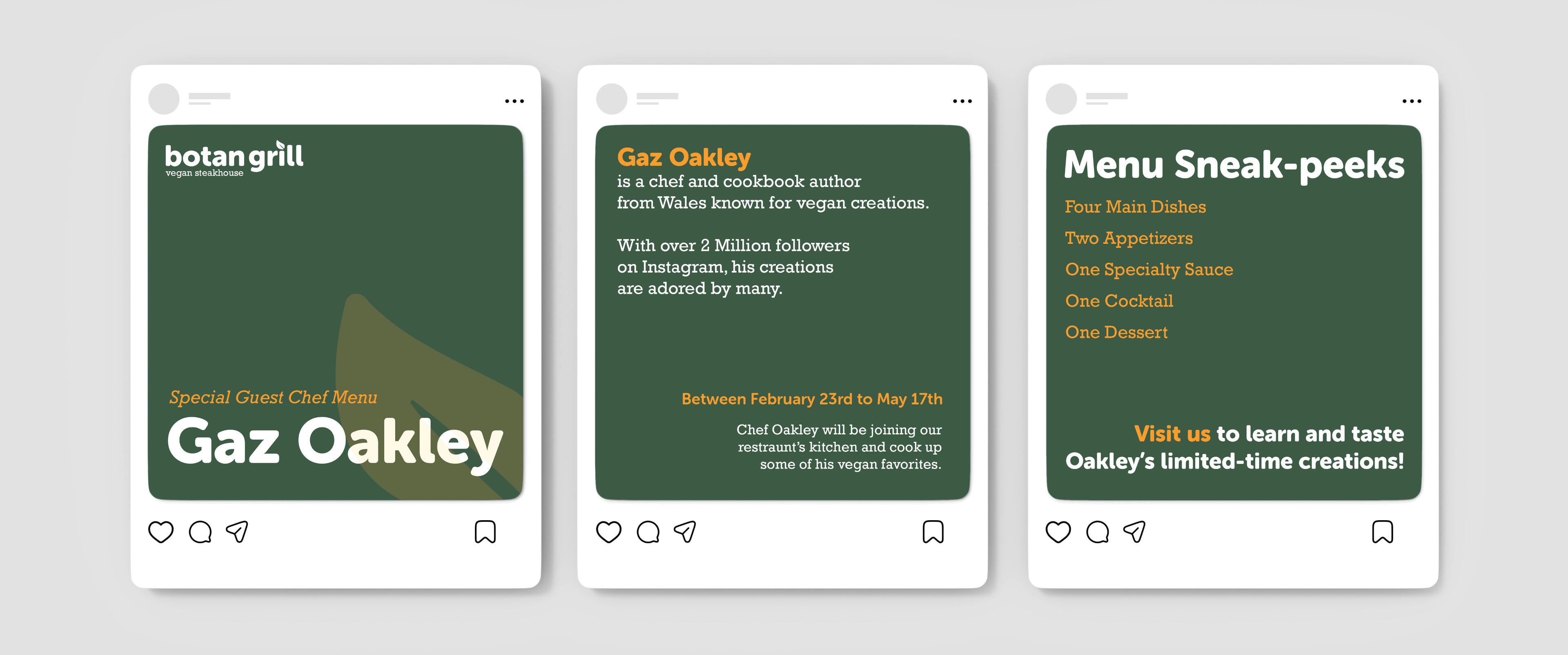
Typographic design of the menu, announcement poster, and Instragram carousel for a Imaginary Vegan Steakhouse located in Chicago. (CLASS PROJECT)

Public Safety Announcement Posters focused on the topic and differences of Service Animals and Emotional Support Animals. (CLASS PROJECT)


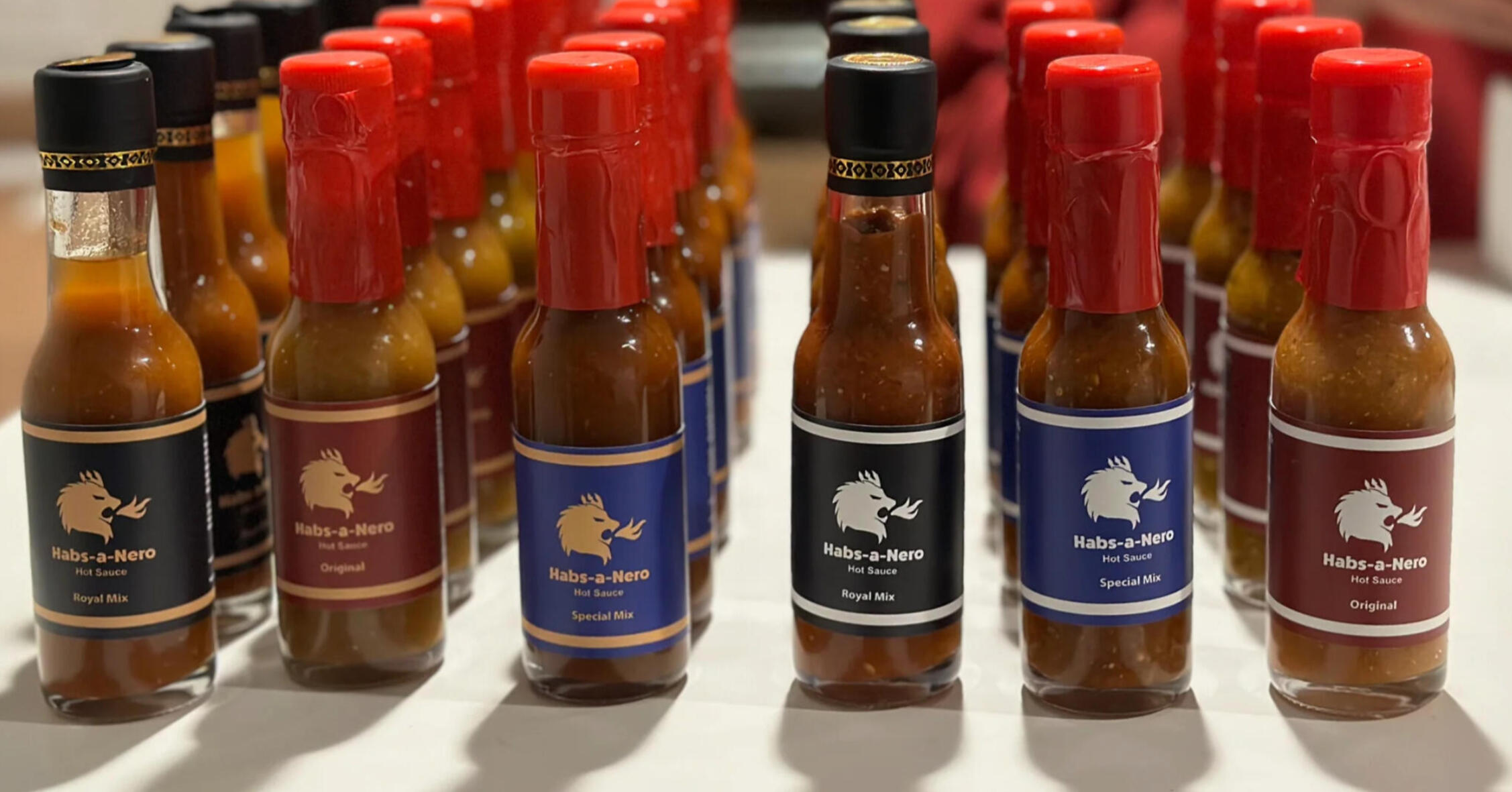
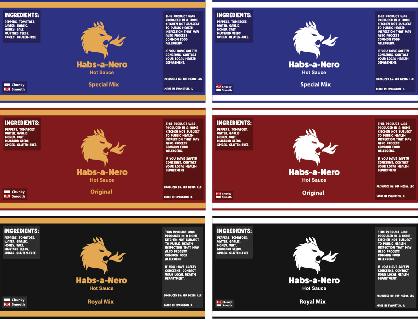
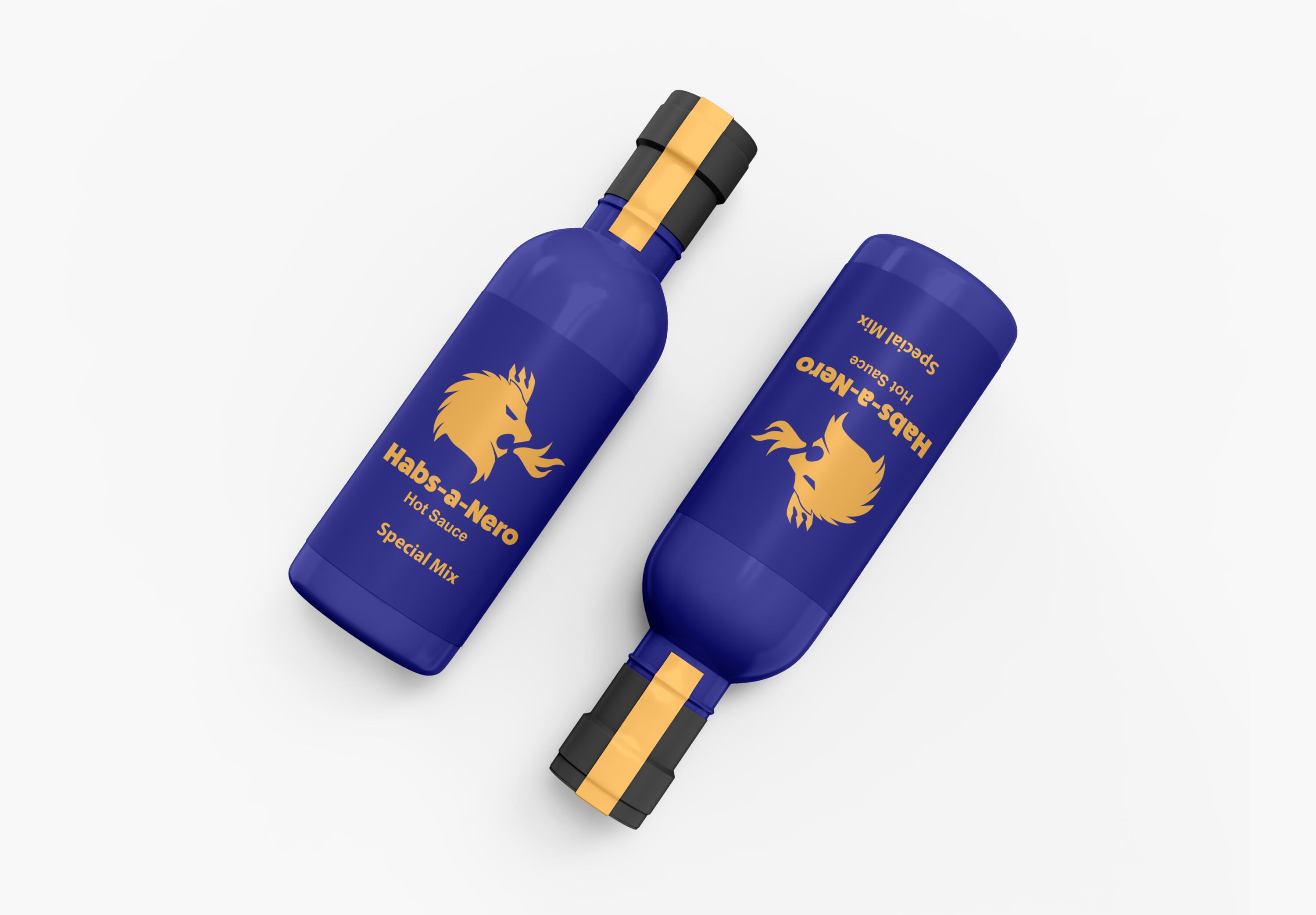
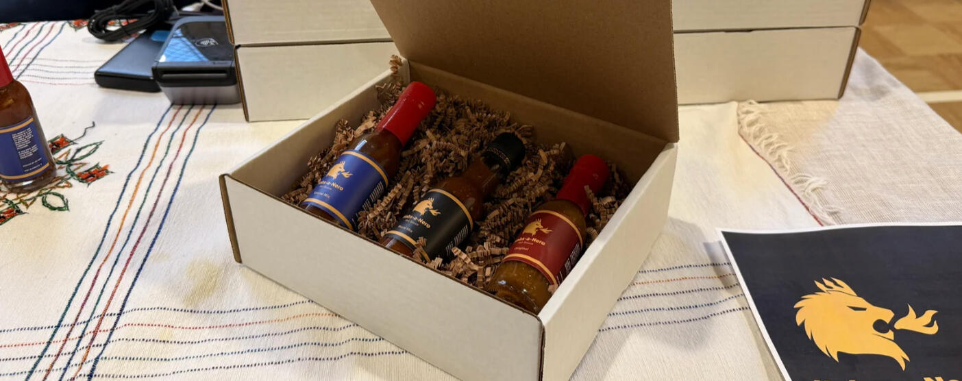
Habs-A-Nero Hot Sauce
Habsanero is a homemade Ethiopian-inspired small batch hot sauce made in Evanston, IL.
Website: habsanero.com
Background
My family has always integrated my younger brother's culture since my family adopted him. He enjoys cooking and baking, which evolved into starting a business with hot sauce back during the COVID pandemic. It started out small, making batches for family members and then grew into people around the world asking for his hot sauce. Back in 2021, my brother and father were looking to make it a real business. They both asked for my help in designing a logo and brand identity.
Challenge
My goal with this project was to capture the regal Ethiopian identity that the hot sauce taste and creator stem from. After doing cultural research, I found the lion as one of the most key figures in Ethiopian culture; a symbol of strength and the biblical bearer of the crown. I wanted to capture the spice factor of the hot sauce, adding a roaring flame.
Process
As my first project collaborating with a business and as a young designer, I didn’t document my process as thoroughly as I could have. When creating this piece, I studied many different lion references and developed the mark you see now. Since then, I’ve significantly evolved my ideation and design process to be more thorough.Color played a major role in this project, as I wanted to reflect the beauty and strength of Ethiopian culture. The strong, simple gold-yellow of the logo is versatile and pairs well with a variety of colors. When combined with blue, it creates a noble, elevated aesthetic that highlights the sauce’s “special” flavor. Paired with red, it conveys traditional warmth, and with black, it gives the brand a royal sense of exclusivity. I also created a white logo variant to help distinguish the sauce consistencies more easily– allowing frequent customers to identify the differences without needing to examine each bottle.
Adobe Stock with Education Liscense by Graphypix
Outcome
Habs-a-nero is now popular among many and there are plans to sell at the Evanston Farmers' Market in coming years. On the side I continue to contribute to their business development. Every 2 months, new batches are hand-made and packaged following cottage kitchen regulations. With a secret recipe and fresh peppers, Habs-a-nero hopes you'll give their sauce a try.
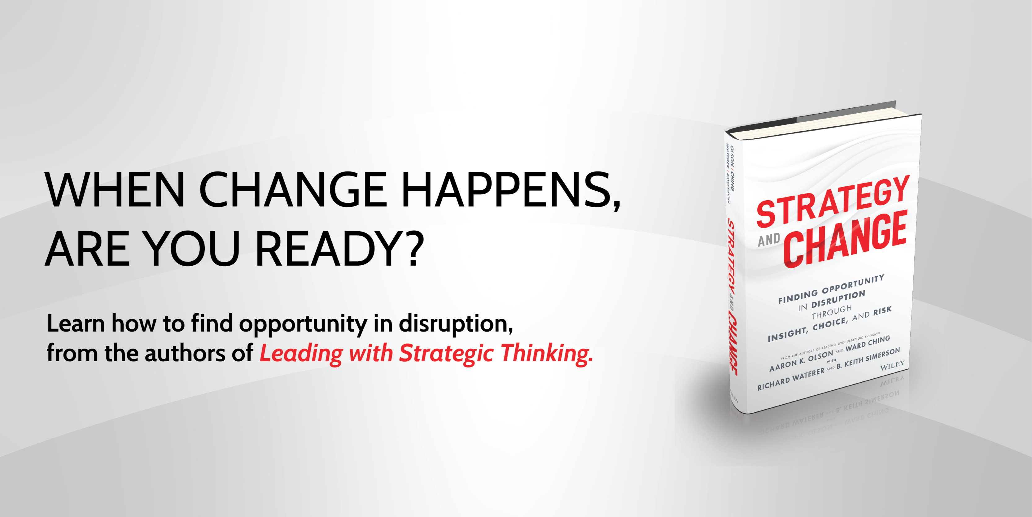
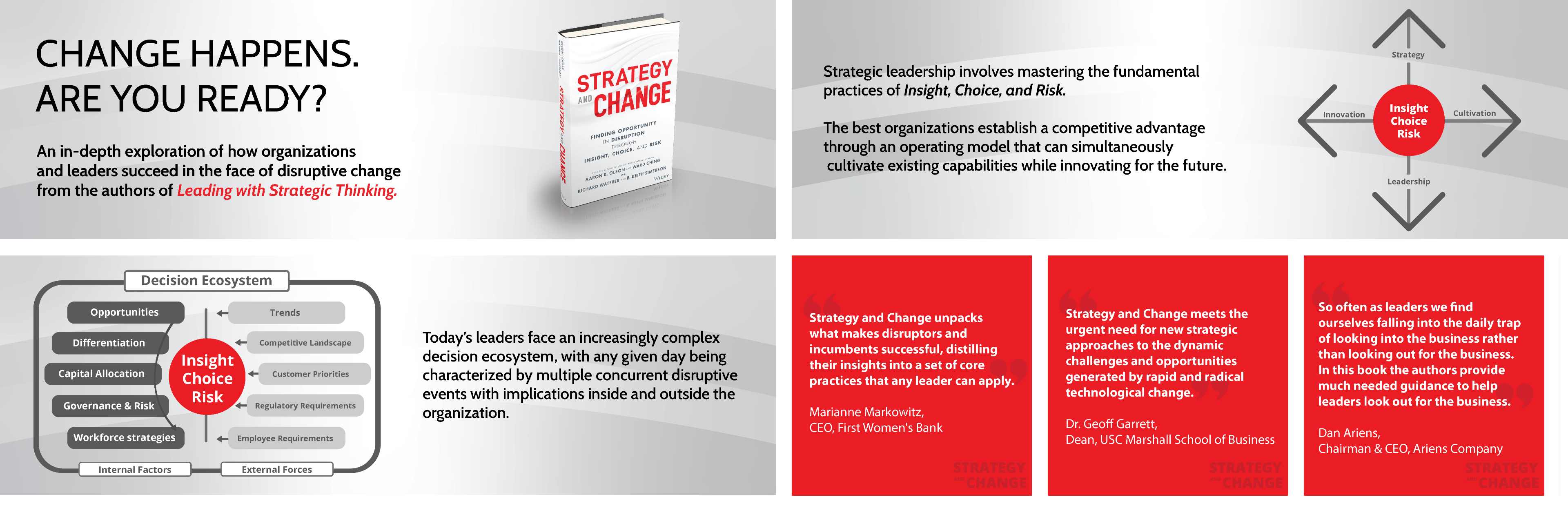
Strategy and Change
Book guides leaders to turn disruption into opportunity through strategic insight and smart risk-taking.
Website: strategyandchange.net
Background
Strategy and Change by Aaron K. Olson, Ward Ching, Richard Waterer, and BK Simerson, Ed.D., is a practical guide to developing strategic leadership skills and helping readers make informed decisions and navigate risk in today’s unpredictable work environments.In January 2025, Aaron Olson approached me with the opportunity to design book graphics, infographics, promotional materials, and a professional website. I had never worked on a publication or an established brand before, but I accepted the challenge and the opportunities it presented.
Challenge
A major challenge in this project was adapting to a continuous cycle of critique and revision. I wasn’t used to receiving such frequent feedback, so it pushed me out of my comfort zone. However, working through those revisions strengthened my designs, and I’m proud of the final outcomes that were chosen.Another challenge was learning to build a website through Squarespace. While I had some experience with simple web design on Carrd, transitioning to a different platform required learning new tools and workflows. Navigating that learning curve helped expand my web design skills and confidence.
Process
Unlike my usual process of sketching concepts from scratch, I was given mock-ups that reflected the client’s vision for the designs. Using those concept drawings as a guide, I recreated and refined the forms in Illustrator while maintaining a consistent brand style. Much of the work was done side-by-side with the author, which allowed for constant feedback and helped advance the design process.My work on this book includes the website, designs within the chapters, social media posts/infographics, slide deck design, and worksheets. I contributed to the book cover by providing ideation concepts, but was ultimately designed by designers at Wiley and Sons.
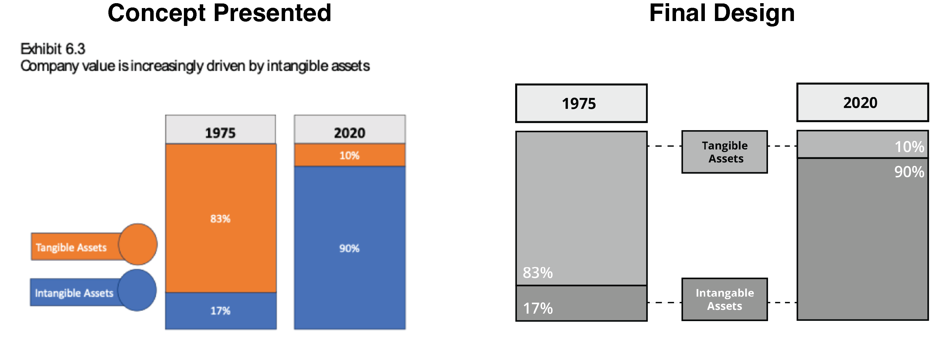
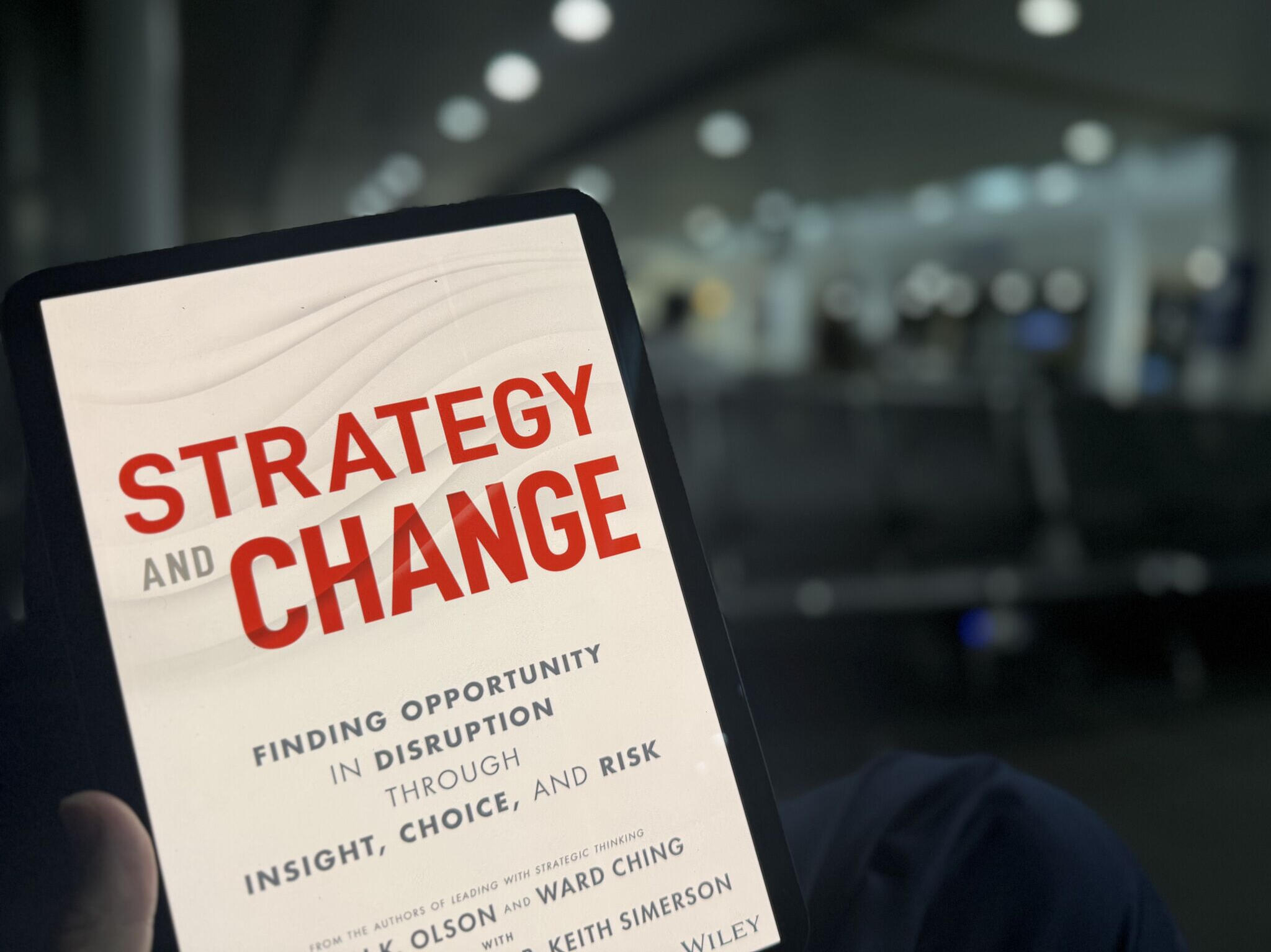
Photo from Aaron Olson on LinkedIn: Post
Outcome
The project concluded with a cohesive brand system across the book’s visuals, infographics, and website. The book was released in September 2025 and has sold in many different stores including Amazon. It was an amazing experience to work with the authors and be apart of designing for a book.
Guidy Application
Application for your phone which helps guide people with disabilities to accessible locations, items and people.
This project was an assignment for Graphic Design Studio II at RIT.
Background
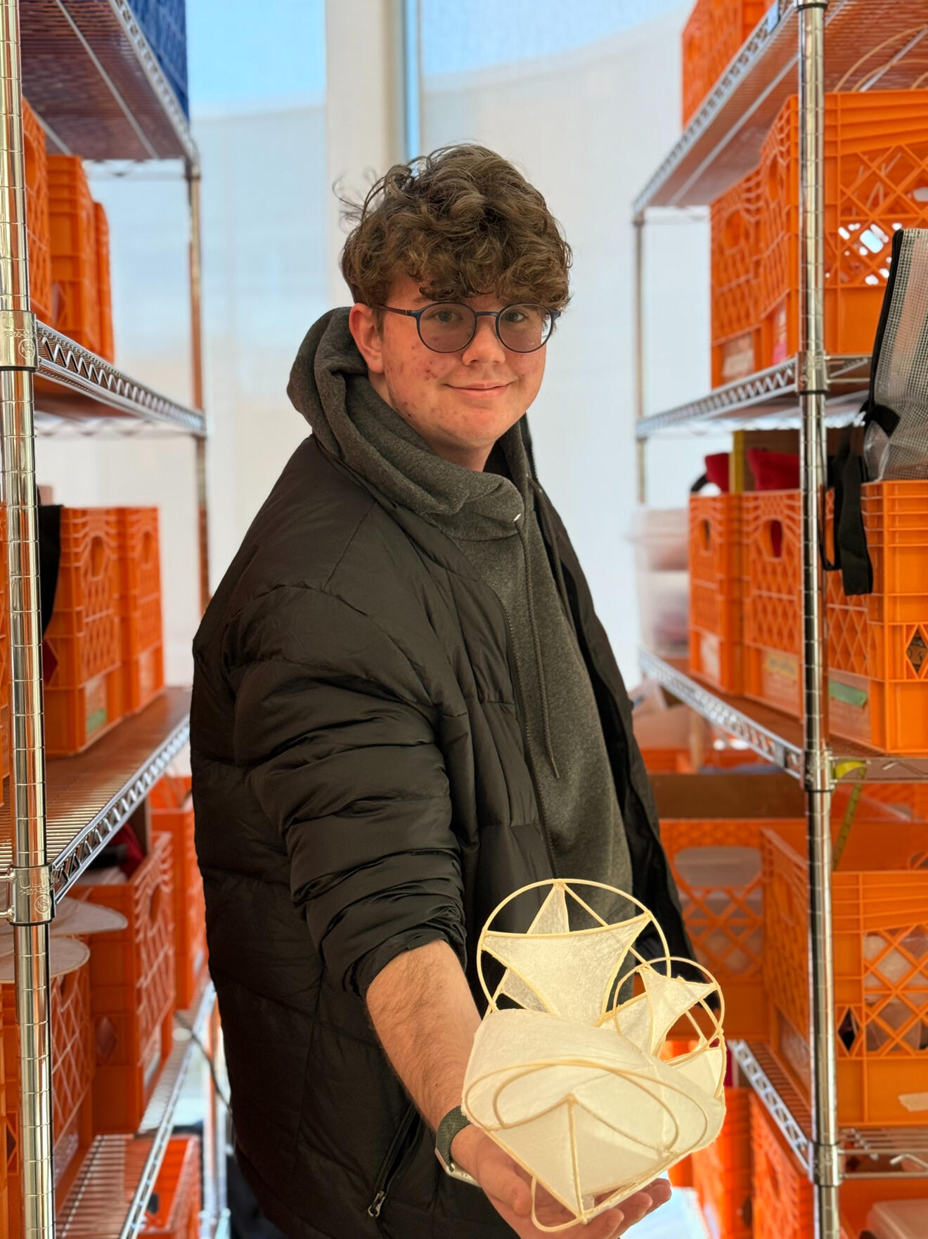
The premise of this project was creating logo design and simple, cohesive branding for a business we made. Among the marketing categories presented, I chose to focus on developing a service. After ideation and looking into different interests I have, I ultimately decided to focus on disability. Other focuses I looked into included connections (social media), video games, illustration, and animals.Guidy is an application for your phone which helps people with disabilities find accessible locations such as elevators, ramps, maps, TTYs, and more. Points on the map are provided by people in local areas and confirmed by others nearby. Using AR, the application can guide a user via pathway to the service or technology they need.
Challenge
Although I had previous experience in branding doing Habs-a-nero, this project helped me practice more thoughtful ideation– sketching, refining, planning, naming, and color. As a app catering to disability access, every piece of the brand would have to be accessible– it must be visually contrasting regardless of color blindness, legible for those with dyslexia, and even helpful to those with visual issues. With this in mind, I did a lot of research into all of these variables instead of just going for something that looks nice to the eye.


Process
Starting out on paper, I mapped out different forms of accessibility and global signs for disability access or assistance. Simultaneously, I tried to develop logos and names using word association, looking at other languages, and a couple of sketches for logo designs. While ideating, I made note of existing services and their logos, to develop one that didn't resemble others.
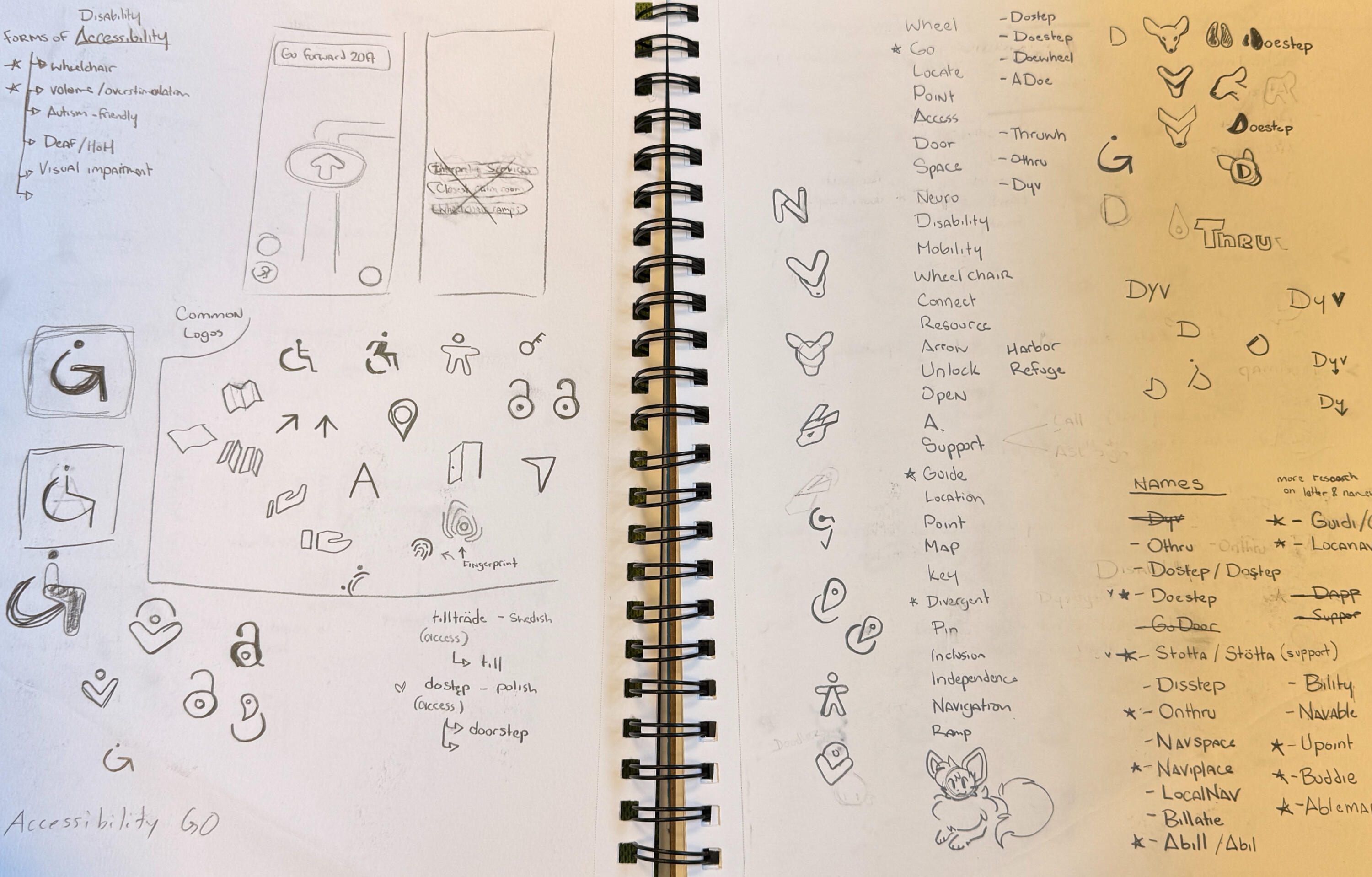
Solution
In the end, I went with the name "Guidy" to resonate with users that the brand is friendly and helpful. In my typeface studies, I found Museo Sans rounded as the most legible for all users that matched the smooth points of the logo.The imagery behind the logo point out 3 different parts: an arrow to express guidance and travel, a "G" for Guidy, and its hinting to the common accessibility logo you often see. Altogether, it creates a cohesive design that highlights its purpose.When studying color, I found that the blue-yellow palette worked the best, visible in all forms of color blindness and allowing the important information to be the focal point.


Outcome
Overall, I am very proud of my final work and enjoyed this project a lot; being able to do the work I aspire to do and connect it to improving accessibility. In the future, if I have time and money, I would love to make this application become a real service that helps people around the world.
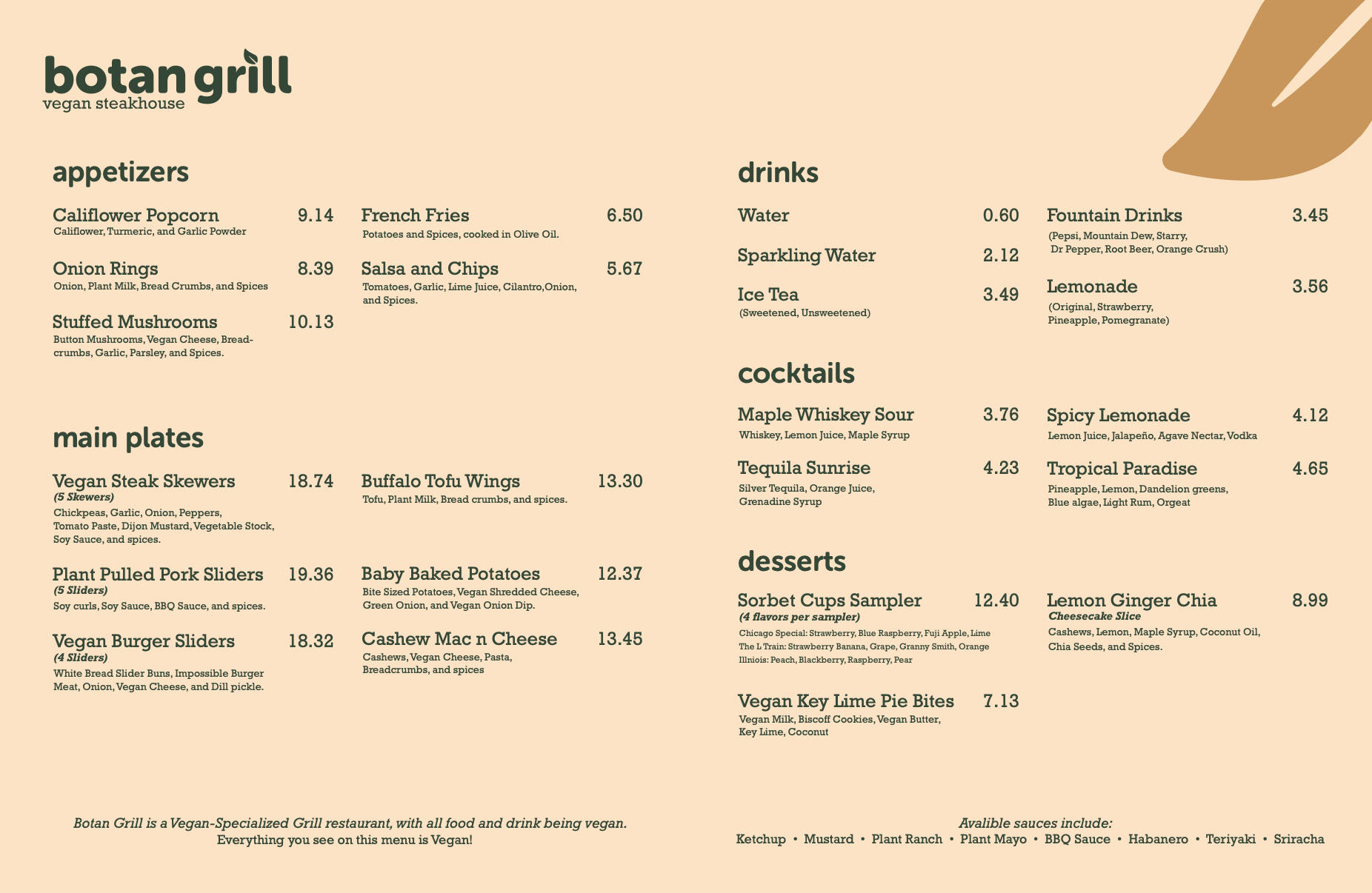
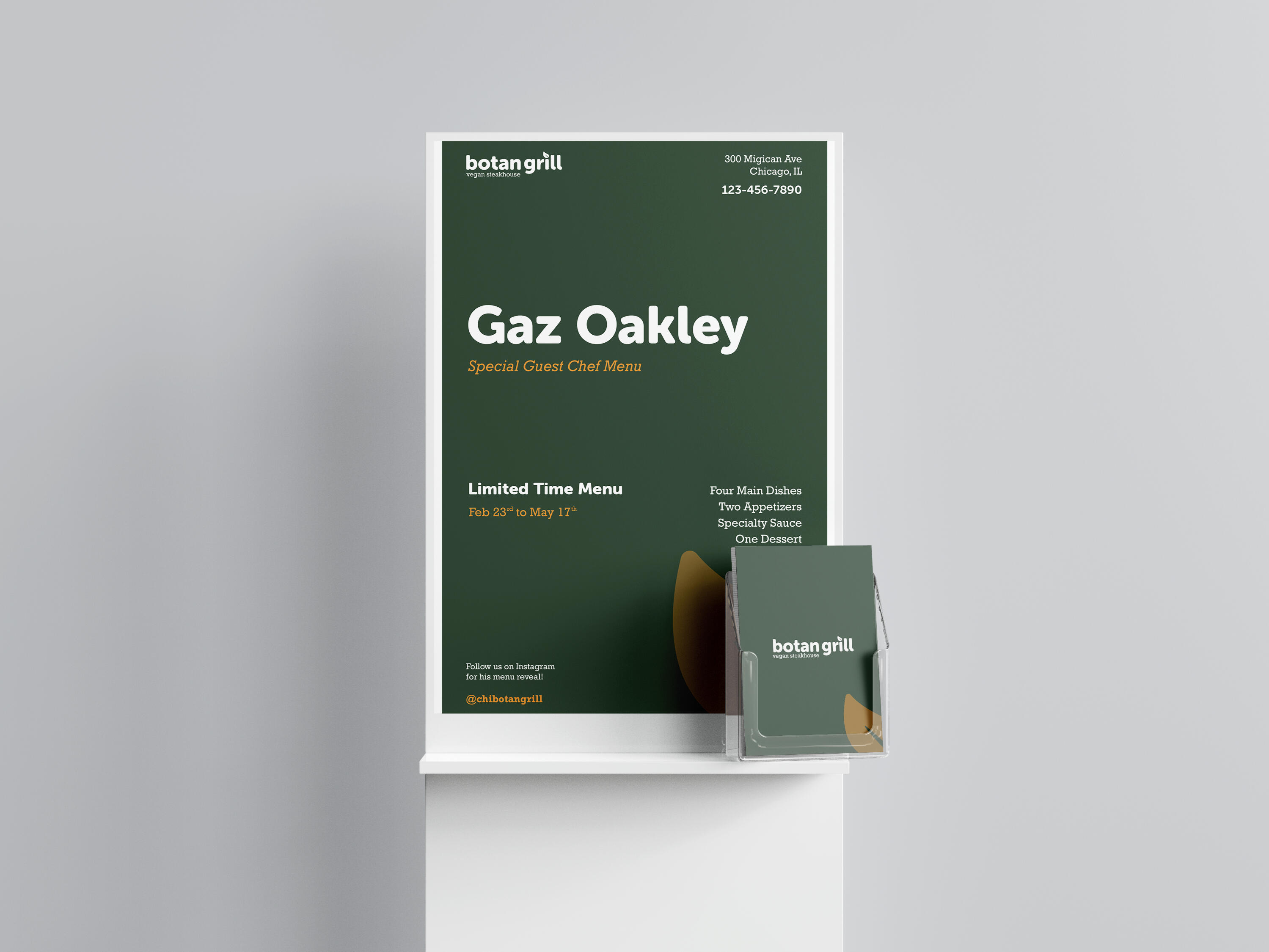
Botan Grill Restraunt
Typography design project for an fictional Vegan Steakhouse located in Chicago.
This project was an assignment for Typography I at RIT.
Background
For this assignment, we were challenged to design for a fictional restaurant using typography as the primary visual element in our compositions and deliverables. By thinking typographically and systematically, we focused on hierarchy, composition, message intent, and context throughout the design process.I was assigned a vegan small-plate restaurant with a steakhouse aesthetic located in Chicago, IL with music defining the experience and a chef collaboration involved.
Challenge
As someone who read things visually and relies on visuals to connect themes, working with purely typography was quite a challenge. To steer all of my visual creativity that was now limited to only type, I focused on expressing themes through color, typefaces, and content. It was a bigger challenge knowing that my food and aesthetic were polar opposites, however in the long run made it a very fun project.


Process
I started off with word lists for each characteristic of my restaurant and then advancing onto mood boards and analyzing how typefaces are used in different parts. By looking at existing brands and typefaces, I was able to really get a sense of what might be useful as a focal point.The name of my restaurant is Botan Grill; a play on the word botany in relation to the vegan food served. With steakhouses being very dark warm tones and vegan restaurants being more green-natural color, I decided to express the primary name with a dark green to involve both.After some light sketching, creating food items, and deciding some of the content for my chef collaboration, I began to design my menu. While in progress, I began to learn and practice leading, kerning, spacing, and a lot more about Adobe Indesign.
Free Poster Display Mockup from Mockups-Design.com
Outcome
After a lot of new experiences and challenges, I was able to develop a cohesive design for all 3 criteria and was able to learn more about importance of typography. During my process, I valued and reflected on a lot from the feedback received over this process. I found it extremely helpful when Type designer Steve Matteson visited to assist us in our designs and provided clarity to obstacles I was facing.
Service Animal PSA Posters
Public Safety Announcement Posters focused on the topic and differences of Service Animals and Emotional Support Animals.
This project was an assignment for Graphic Design Studio II at RIT.

Background
This project tasked us to choose a social issue from a list of broad topics and to narrow down a specific cause. The goal was to do background research to gain a deeper understanding, then design poster(s) highlighting that subject.
Challenge
The main challenge of this project came to choosing a topic and researching my cause. When surveying ideas, my top 3 subjects were to focus on Diversity, Animals, or Mental Health. From there, I narrowed it down and decided to talk about Service animal access rights.Although I had some background knowledge in the struggles of Service dogs and their owners, I wanted to make sure I fully understood and knew what to focus on. After some failed attempts to pool information via survey, I focused on the facts I could find via the ADA and other resources.

Process
Once completing my research, I began to sketch and determine symbols that would help convey my message. I wanted something simple yet strong and eye-catching. I chose to make my own company and quick logo for this project, as I didn't know of any organizations that directly focused on the topic at hand.My logo depicts a cat and dog for simple references. The red dog silhouette contains a simple health cross to insinuate a Service Dog as a medical need, while the blue cat has a heart symbol to convey ESAs as pets of comfort.


Solution
From there, I decided my posters would be primarily information based rather than on imagery to ensure the viewer to be educated. Bolding and enlarging words aided to grab attention, compelling the viewer to be interested in its significance to the rest of the poster. Capturing attention of a viewer is important, as it helps a brand or organization be recognized.

Outcome
This probably was one of my favorite projects this semester, alongside my Guidy application. When going about projects and knowing my future goals, I try to expand my knowledge about different forms of accessibility. These posters are simple, easy to read, grab a viewers attention, and most importantly highlight access that is often overlooked.
Photography & Videography
Varied Photography from Seattle, Washington


Pet and Animal Photography


Photography (AP 2D)
I took this class my senior year of high school, looking to broaden my knowledge rather than focus on earning AP credits. Instead, I explored different topics, as well as refined my skills in imagery and editing.
A good portion of my focus was on types of aging– toys, experiences, design, and spaces.


Videography
Illustration and Digital Art
Lorem Ipsum is simply dummy text of the printing and typesetting industry.
Digital Illustration


Traditional Artwork


Varied Projects
Smaller design projects I've worked on for freelance, non-profit, and practice.
")
")
")
")
")
")
")
")
")
")
")
")
About
What I do
Brand & Visual Identity
Creating cohesive design systems, including logos, typography, color palettes, and visual standards that help brands communicate clearly and consistently.
Marketing & Promotional Design
Designing engaging promotional materials such as posters, social media graphics, infographics, and digital advertising assets to appeal to target audiences.
Illustration & Digital Art
Creating custom illustrations, icons, and graphics that support branding and storytelling.
Photography & Editing
Capturing and editing photography for use in design projects and ensuring images fit seamlessly into brand and marketing materials.
Accessible & Inclusive Design
I prioritize readability, contrast, and usability, integrating accessibility practices and leveraging basic ASL knowledge to support inclusive communication. I believe all people, regardless of their abilities, should be able to understand the world like any other abled-person.
Industry Experience
Strategy & Change
Freelance
Non-Profit
What Clients Are Saying
"I have spent quite a bit of time on the Strategy and Change website… The website should win an award…it is spot-on on all fronts, on all levels! Kudos to Liam on this amazing accomplishment!"
B. Keith Simerson, Ed.D.
Author @ Strategy and Change
"Amazing work in a very short amount of time! Very professional too! [Liam] is amazing and so is his art!"
DANIEL
Online creator (anon)